Did you know opens on mobile devices now account for just over 50% of all email opens? It may seem like a minor factor in your marketing efforts, but optimizing your emails for all users is crucial.
Now is the time to understand the differences between responsive vs. non-responsive email marketing to maximize your campaigns’ performance and customers’ experience.
The email design can make or break a customer’s interaction with your business. With 67% of consumers checking their emails via a mobile device, responsive email marketing is becoming more important.
- Click here to preview verified B2B prospects for email marketing
What is responsive email marketing?
Responsive email marketing is a form of email marketing that ensures your brand’s message appears correctly on any device, whether desktop, tablet, or mobile.
Responsive content allows users to view the content in a way that works for the device they are using. It also enables users to interact with minimal resizing, panning, and scrolling.
In simple words, a responsive email is an email that can detect the screen size and orientation of a person’s device and automatically adjust the layout to fit the screen.
Responsive Vs. Non-Responsive Email Marketing – What’s the difference?
With the popularity of mobile devices, it makes sense that most emails get opened on smartphones and tablets. As a result, the responsive design of emails has become a critical aspect of email marketing success.

Open rates tend to be higher with responsive design emails because they are readable on any device. They do not fall into spam folders or stray too far from what a user was looking for.
A non-responsive email maintains its original format no matter which device you’re using, it doesn’t change based on a device’s screen size. This leads to users/readers getting stuck scrolling left and right on a smartphone or reading too much text on a widescreen monitor.
- Click here to preview verified B2B prospects for email marketing
Pros and cons of responsive email marketing
Pros
- Responsive email templates can save you tons of design time.
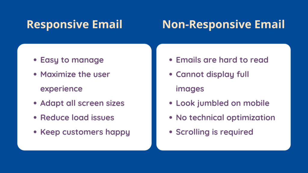
- Responsive email is easy to manage. It can easily maximize the user experience.
- You only have one single template, which means you don’t need to update, save and store multiple versions of the same email.
- A Responsive design is easy to create. It adapts to all screen sizes seamlessly.
- It saves your audience time and reduces load issues. Keep customers happy and engaged with your content.
- Responsive templates help you create emails that maintain their intended layout.
Cons
- The design of a responsive email template can get complex if you try to customize it for multiple screens.
- Some email clients and devices may show weird text formatting. They won’t display your images and other elements appropriately.
- It requires a high level of programming skill and can be costly to implement.
- Responsive isn’t as easy as simply copying the code and tweaking the design to your liking.
- Load time is longer, which is frustrating for readers. They might abandon your email before viewing your message.
- Responsive design requires extensive programming knowledge. It can be challenging to alter strategies in response to changing situations.
What is non-responsive email marketing?
A non-responsive email template is an email that doesn’t adapt to the device size viewing it. It looks great on a desktop, but the email fails to adjust to the small screen.
In technical terms, a non-responsive email is an email template that is ‘hard coded‘ at specific widths and cannot adapt to various screen sizes. Most Non-responsive emails have a design of 600 pixels or 640 pixels.
The recent updates make a responsive design for most email clients a minimum requirement. If your email has a fixed width: 600 or 640 pixels, it will either refuse delivery to many clients or not show all of your content.
- Click here to preview verified B2B prospects for email marketing
Pros and cons of non-responsive email design
Pros
- Simple drag-and-drop technology allows you to create an effective non-responsive email campaign in no time at all.
- Non-responsive templates are suitable for sending long emails with lots of content.
- You can pull all the content on one large canvas instead of splitting it into columns as responsive templates do.
- Non-responsive templates require less programming technology which makes them cost-efficient.
Cons
- The non-responsive template breaks your layout when the emails appear on a smaller screen.
- The emails will be hard to read, and the user has to scroll through them to read.
- Another main drawback of this non-responsive email is it cannot display full-width images.
- They end up looking jumbled on smaller screens.
- The non-responsive email template has no technical optimization for mobile devices.
Responsive Vs. Non-Responsive Email Marketing – Statistics
When it comes to responsive vs. non-responsive email marketing, it is no doubt that mobile engagement is higher with responsive emails
Yesmail’s Benchmark Report shows more than half of all emails get opened on mobile devices over the past three years. However, simply getting an email opened is not the ultimate goal.
Marketing content should engage consumers to create a powerful brand identity. Users are more likely to interact with responsive emails on their mobile devices.
- An estimated 57.2 percent of all emails are now opened on mobile devices, including 47.2 percent on smartphones and 10 percent on tablets. On average, less than 50% of non-responsive emails get opened.
- Open and click rates are higher on our smartphones compared to other devices. Responsive emails have 58% clicks, while non-responsive emails have 45%.
- The average open and click-through rate for a responsive email is 22%. The CTR for non-responsive emails is only 10%.
Reasons to use responsive email marketing
Responsive email design is a must if you’re sending marketing emails and your audience is reaching for smartphones and tablets as their primary device.
- Click here to preview verified B2B prospects for email marketing
Responsive email templates are an effective way of communicating with both current and potential customers. It provides the correct information at the right time. Here are a few reasons why you should prefer responsive email marketing:
- Better user experience: No matter how users browse emails on mobile devices, a responsive email template will show them the content professionally and consistently. With responsive temples, you can ensure a seamless user experience for the viewers.
- Better click-through rate: Responsive email marketing is the easiest, fastest, and most cost-effective way to build and manage an effective email marketing campaign. It ultimately results in more opens, clicks, and profits for you.
- Increase traffic and leads: Responsive email templates allow you to read them on any screen size. It generates leads, drives traffic, and builds your brand.
Possible challenges when using responsive email marketing
Businesses may encounter several challenges when using responsive email marketing, including:
- Cross-device compatibility: It can be difficult to ensure that images, text, and design are consistent across different devices.
- Adaptability of icons and images: These will be viewed on devices with varying screen sizes, which can present challenges.
- Limited support for CSS in email clients: This can make it challenging to create responsive designs.
- Testing and debugging responsive emails: This can be difficult, making it hard to ensure that emails look good on all devices.
Wrapping up
While responsive web design is not just a trend anymore, many email marketers still debate responsive vs. non-responsive email marketing. Poor user experience results in little or no response, which ultimately means no ROI.
- Click here to preview verified B2B prospects for email marketing
The reality is that more and more people are using their smartphones to check their emails. Responsive email marketing is an essential element in retaining your customers.
Brands strive to leave a lasting impact on their subscribers. You can’t risk neglecting a detail as fundamental as your email marketing format. Since many people now read their emails on their smartphones and tablets, responsive design is no longer an option.
